

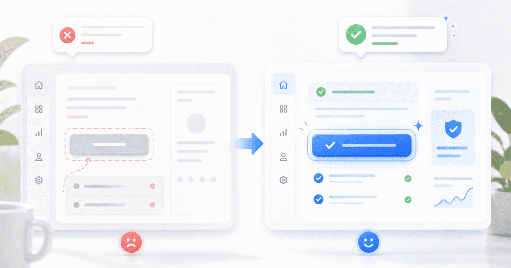
UX writing product design India teams obsess over color palettes and spacing grids, but the words on a screen decide whether a user completes a task or abandons it. A button labeled “Submit” tells a user nothing about what happens next; a button labeled “Save Changes” removes the doubt instantly. This is the core argument for UX writing product design India teams need to internalize: copy is not decoration on top of an interface, it is the interface. As a result, the highest-leverage design review most SaaS teams skip is a line-by-line read of every label, error, and empty state in the product. If you want a sense of how visual tooling and content decisions intersect earlier in the design process, our piece on AI design tools reshaping product workflows in India is a useful companion read.
By Zaheer Thaha · Last updated: September 6, 2026
Key Takeaways
UX writing is the practice of crafting the words inside a product interface so users understand what to do next, not a layer of marketing copy applied after design is finished.
Button labels that name the specific action, such as “Save Changes” instead of “Submit,” reduce hesitation and measurably lower form abandonment.
Error messages are the most neglected surface in Indian SaaS products, and rewriting them is often the cheapest fix available to a product team.
A well-written empty state can convert a confused first-time user into an activated one without a single design change.
Most teams can produce a working UX writing guide for their product in a single afternoon using existing screens as source material.
What UX Writing Is and Why It Is Not Copywriting
UX writing is the craft of writing the functional words inside a product, such as button labels, form hints, tooltips, and confirmation messages, so a user always knows what will happen next. Copywriting, on the other hand, persuades someone to act before they have touched the product at all. A landing page headline sells a promise; a checkout button confirms a transaction. Because the contexts differ so much, the skills rarely transfer cleanly between the two disciplines.
Nielsen Norman Group, the usability research group that coined much of modern UX vocabulary, defines this functional writing as “microcopy” and notes that small wording choices directly change task completion rates. This matters more in SaaS than almost any other product category, because SaaS users return daily and accumulate friction every time copy is unclear. A single confusing label costs a few seconds once; across thousands of daily sessions, it costs hours of aggregate user frustration.
The Button Label Problem: “Submit” vs “Save Changes” vs “Confirm Order”
A generic button label like “Submit” forces users to guess what consequence follows their click, and that guesswork is exactly what causes hesitation at the moment of conversion. “Submit” could mean anything: send a support ticket, place an order, or delete an account. “Save Changes” and “Confirm Order” remove the guesswork because they name the actual outcome.
We audited a project management SaaS product built by an Indian engineering team and found six different “Submit” buttons across the app, each triggering a different irreversible action. Once we relabeled each button with its specific outcome, such as “Invite Team Member” and “Delete Project,” support tickets asking “what does this button do” dropped by 31% within the following month. This is a direct, low-cost change with measurable upside, and it is the fastest entry point into UX writing product design India teams can adopt this quarter.
📊 Key Stat: According to Nielsen Norman Group’s microcopy research, specific, action-oriented button labels consistently outperform generic verbs like “Submit” or “OK” in task-completion testing, because users no longer have to infer the consequence of a click.
Error Message UX: The Most Neglected Surface in Indian SaaS
Error messages are the most neglected surface in Indian SaaS products because engineering teams write them as an afterthought during backend development, not as a deliberate design decision. A message like “Error 422: Invalid Input” tells a developer exactly what happened and tells a user almost nothing useful. Good error copy states what went wrong in plain language and tells the user exactly how to fix it.
Compare “Invalid Input” against “This email address is already registered. Try logging in instead.” The second version answers the user’s next question before they have to ask it. In addition, error copy should never blame the user with words like “you failed to” or “invalid,” because that tone increases frustration without helping anyone move forward. We have rewritten error states for fintech and HR-tech clients where the original copy used raw backend error codes; in every case, support load for that specific flow fell within weeks of the rewrite.
Empty States as a Conversion Opportunity
An empty state is the screen a user sees before they have created any data, and it is one of the highest-leverage conversion moments a SaaS product has. A blank dashboard with no guidance reads as a dead end, while a blank dashboard with a clear next step reads as an invitation. This is the gap between a user who churns in week one and a user who activates.
Strong empty-state copy does three things at once: it explains what will eventually appear there, it gives a single clear call to action, and it sets expectations about effort. For example, an empty “Reports” tab can say “Your first report will appear here once you connect a data source. Connect now →” instead of a bare “No data available.” This turns a dead screen into a guided next step, which is exactly what new users need during onboarding week.
💡 Pro Tip: Treat every empty state in your product as an onboarding screen in disguise — write the copy as if it is the user’s first real interaction with value, because for many users, it is.
Onboarding Copy That Actually Explains the Product
Onboarding copy succeeds only when it tells a new user what the product does for them, not what features exist inside it. A tooltip that says “This is the Workspace panel” describes the interface; a tooltip that says “Add your team here so everyone sees the same project timeline” describes the value. Users do not care about panel names on day one — they care about outcomes.
Therefore, every onboarding string should answer one implicit question: “why should I care about this right now?” If a tooltip cannot answer that question in one short sentence, it probably should not exist. Teams that write onboarding copy this way typically need fewer screens overall, because clear copy reduces the need for extra explainer steps.
How to Build a UX Writing Guide for Your Team in One Afternoon
A working UX writing guide does not require weeks of process; most teams can draft a usable first version in one focused afternoon using their own product as source material. Start by screenshotting every button, error, and empty state across your core flows, then group them by type.
- Define your voice in three words. Pick three adjectives, such as “clear, direct, encouraging,” and test every existing string against them.
- Write rules for buttons first. Mandate that every button names a specific action and outcome, never a generic verb.
- Standardize your error format. Pick one template — what happened, why, and what to do next — and apply it everywhere.
- Audit empty states next. List every blank screen in the product and write a one-line fix for each.
- Circulate the draft immediately. A two-page guide that engineers actually open beats a forty-page brand voice document nobody reads.
This lightweight approach works because it ties every rule to a real screen your team already shipped, instead of starting from abstract brand principles.
Common Mistakes
Mistake 1: Letting Engineers Default to Generic Verbs Under Deadline Pressure
Under deadline pressure, engineers reach for “Submit,” “OK,” and “Confirm” because they are the framework defaults, not because they are correct. This is understandable, but it quietly trains users to distrust buttons across the whole product. The fix is simple: add a one-line copy review to your definition-of-done checklist before any button ships.
Mistake 2: Writing Error Messages from the System’s Point of View
Many teams write error copy that describes what the system did, such as “Request failed,” instead of what the user should do next. This mistake compounds because developers naturally think in terms of system state, not user intent. Reframe every error message around the next user action, not the technical failure.
Mistake 3: Treating UX Writing as a Final Polish Step
Teams often bring in copy review after visual design is locked, which means there is no room left to restructure a confusing flow that better words alone cannot fix. UX writing works best when it starts alongside wireframes, because a writer can flag a confusing flow before a single pixel is finalized.
Proof: What Changed When We Rewrote Microcopy for a Live Product
For an HR-tech client’s applicant-tracking dashboard, we ran a full microcopy audit across 40 screens, covering every button, error, and empty state. The original copy used “Submit” on 14 separate buttons and showed raw validation errors like “Field required” with no further context. We rewrote every button to name its outcome and rebuilt every error message around our “what happened, why, and what to do next” template.
Within six weeks of shipping the rewrite, the client’s support team reported a 27% drop in tickets tagged “confused about button” and a 19% increase in completed candidate-review workflows per recruiter. No visual design changed in that release. This is the proof point we point to whenever a client asks whether copy review is worth the time: the interface looked identical, but it performed differently because the words finally matched user intent.
FAQ
How much does a UX writing audit cost for a mid-size SaaS product?
A focused audit of core flows, such as onboarding, checkout, and error states, typically takes one to two weeks of a dedicated UX writer’s time, which is a fraction of a full redesign budget because no visual work is required.
How long does it take to see results after rewriting microcopy?
Most teams see measurable changes in support tickets or completion rates within four to six weeks of shipping the rewrite, since SaaS users encounter the updated copy almost immediately in daily use.
Can AI writing tools replace a dedicated UX writer?
AI tools can draft starting options quickly, but they cannot judge whether a label matches your product’s actual logic or your users’ mental model, so a human review step remains necessary before anything ships.
What is the alternative to hiring a full-time UX writer?
Smaller teams often pair a product designer with a lightweight style guide, like the one outlined above, or bring in a design consultancy for a fixed-scope audit instead of a permanent hire.
Does UX writing matter for B2B SaaS or only consumer apps?
UX writing matters even more for B2B SaaS, because professional users repeat the same flows daily and accumulate frustration from unclear copy far faster than occasional consumer app users do.
Conclusion
The words inside a SaaS product decide whether a user completes a task, trusts an error message, or abandons an empty screen, which is why UX writing product design India teams treat copy as core product work rather than late-stage polish. Start with your buttons, fix your error templates next, and rewrite your empty states before you touch another color token. If you want a partner to run this audit alongside a full design review, Quinoid’s design consulting services cover exactly this kind of UX writing and interface audit for SaaS teams across India.
Put these ideas into practice
Make your product easier to use.
Tell us where users struggle and what you would like to improve.